The new label design has been a further development from the label for the Japanese line
When we began to conceive the Tea Taster’s Box series two years ago, we noticed there is a need for a redesign for all of our product labels. The one that is being used until now was quite hastily put together when I set up TeaHong.com all by myself in 2011.
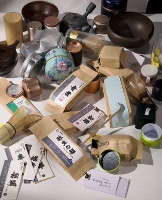
We have tried using a variety of packing containers, label formats while redesigning the graphical elements on the labels
The need to launch some of our Japanese products for online retail was an ideal turning point to start the design process.
We have even thought of changing the container itself. After some material sourcing in Japan, Taiwan, Hong Kong, and China, however, we have concluded that the kraft laminate bag we have been using since 2014 is actually the best for maintaining and delivering quality in the context as an online shop selling globally.
Even throughout the painfully dreadful process of relocating from Hong Kong to Nagoya, the redesign project has been still in progress. A few rounds of ideas have been tested and evaluated.
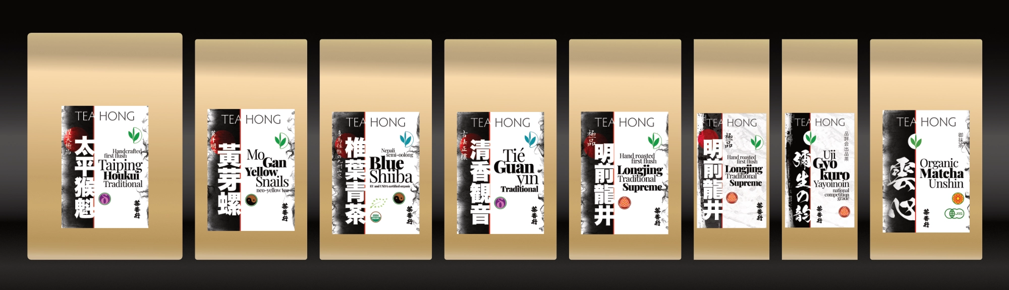
We have put so much of our hearts into this shop, a strong graphic identity is needed to differentiate us. A design that is slightly unorthodox is now finalised and will gradually replace the old one.
During this transition, stocks that are already packed using the old label will be delivered together with those that use the new label. Please bear with us for this not so tidy cut during this process, but I hope you would love the new labels as much as we do.
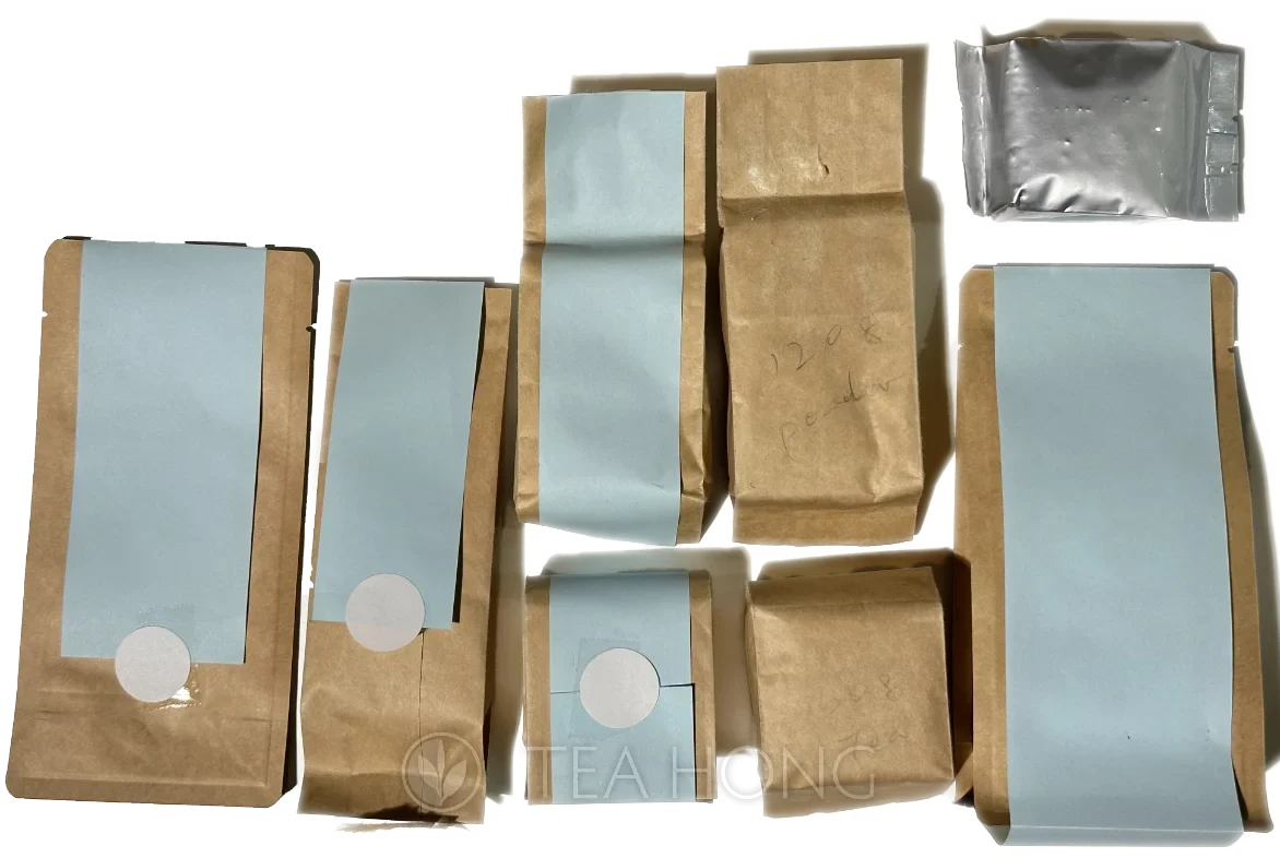
After we have found out that the kraft aluminium laminate bag that we have been using is the optimum pack container, we started trying packing the various Japanese tea into the bags to finalise the best pack net weight and testing different label sizes and application ideas.
We have tried a number of ideas for the label graphics. This is an early one which we gave up quite instantly.

Typographic idea tests in two layout framework ideas
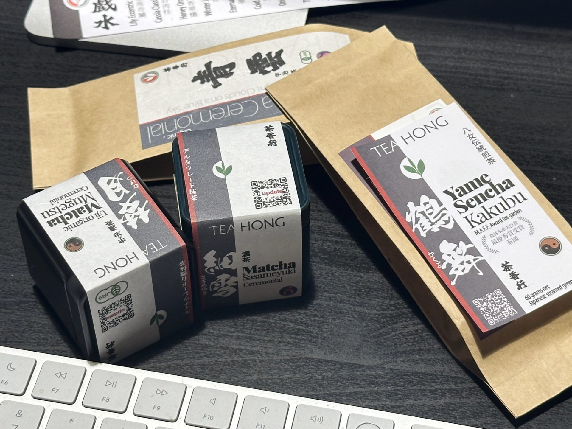
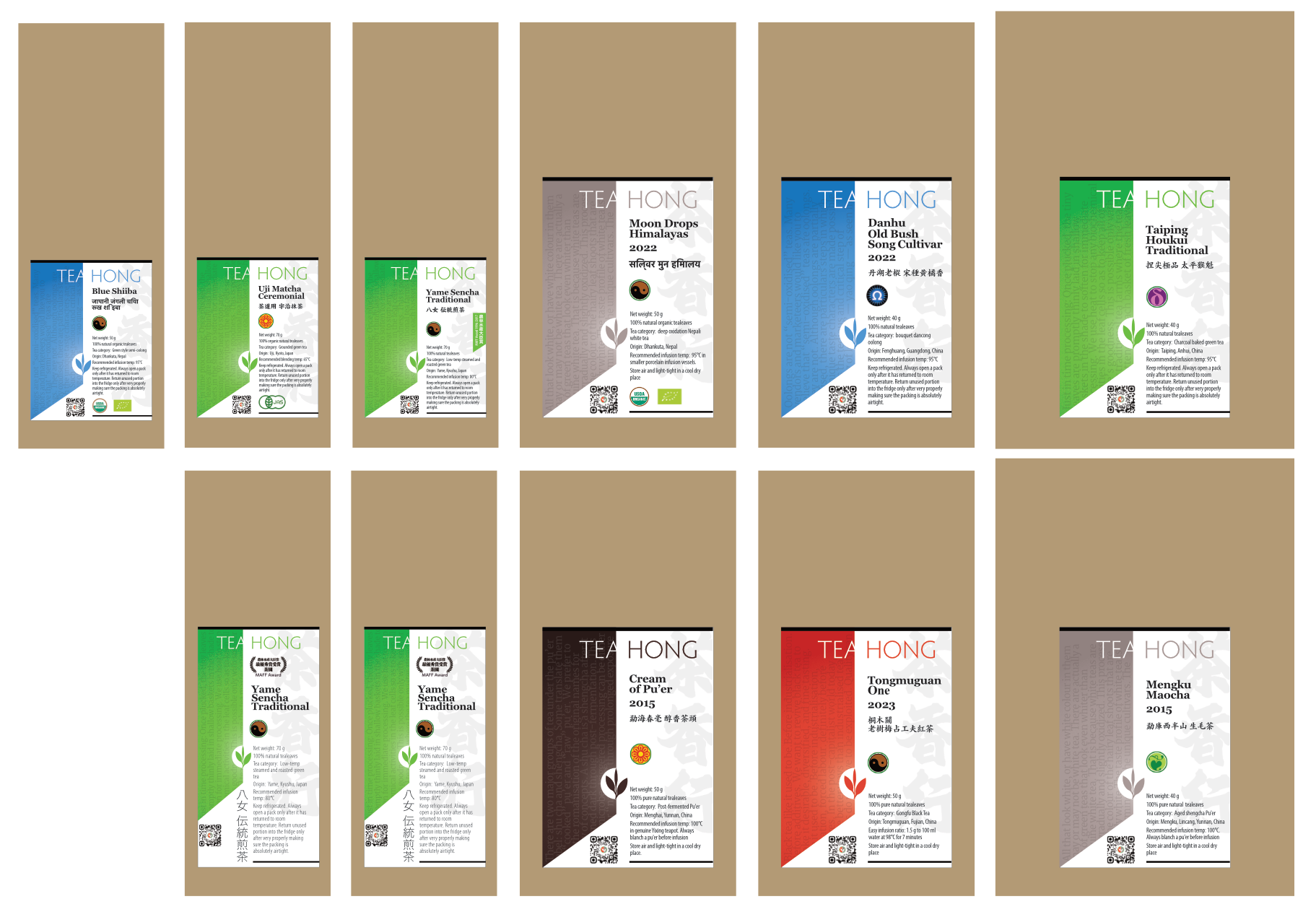
More complete mockups of the final packaging designs of the matcha tea tins and the narrow Kraft pack. This is not the final design yet.
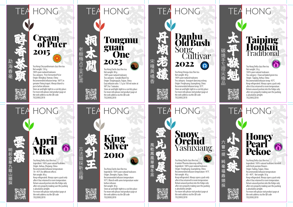
We tested a similar idea on teas outside of the Japanese line and found that the visual signature is still weak. Likely because there are more Chinese characters in the same space, making each character smaller and leaving a larger counter form.
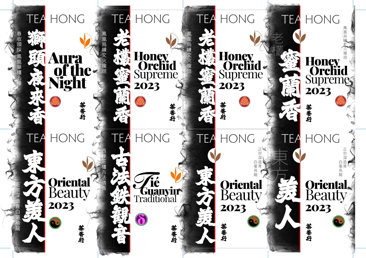
When we have modified the Japanese line label graphic structure to one that we think may work, we tested it out on a Hong Kong sign style calligraphic font.
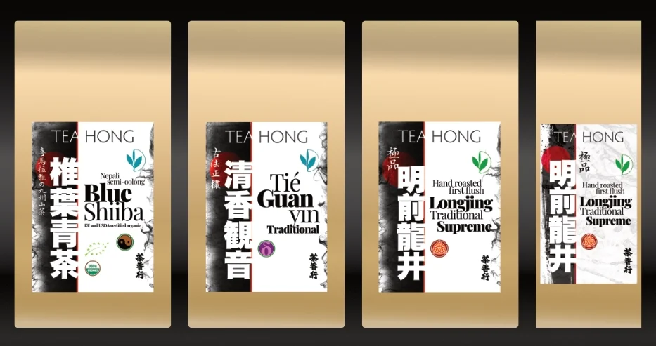
Then we decided that we should use a bold print font instead. This design will gradually replace the old label. It is also likely that within one single order, you will get two types of labels each for different teas during this transition. Maybe that could be reference materials for design schools?
P.S. At a time when ridiculously redundant amount of administrative processes are being forced upon us, while tea production, sampling and logistics are crazily loaded, I feel very blessed that there has been the peaceful distraction of a simple design project that I can escape into for half an hour now and then at the end of a day. The next project? Photography for our new Yixing teapots collections and other tea ware 😉
Comments (0)
Leave a reply
You must be logged in to post a comment.